E-commerce Product Images Best Practices That Drive Conversions

Have you ever thought about why product images are important in the ecommerce industry?
Ecommerce product images play a crucial role in scaling your business by persuading the user with appealing and realistic graphics; plus, image optimization also helps reduce site load, thus increasing the loading speed.
Even buyers themselves agreed upon the fact that while purchasing, prominent images define the decision towards the payment process.When choosing a product for purchase, 75% of online shoppers rely upon product images. Product images are like a conversation with the buyer without saying anything about your product.
When choosing a product for purchase, 75% of online shoppers rely upon product images. Product images are like a conversation with the buyer without saying anything about your product.
Buyers make the judgment while looking at the product’s aesthetics to conclude product quality, which means that images must attract customers’ interest.
However, many businesses are unaware of the practices of displaying product images that persuade the customer to buy the product.
Today, we are going to dive deep into an ecommerce product image guide that builds your brand loyalty, 2x your revenue, and boosts sales.
Top Secrets For Ecommerce Product Photography Best Practices To Increase Conversions
If you are an online store owner, then be sure to follow all the stated guidelines which assist your visitors in making the buying decision in no time and convert your visitor to loyal customers, so let’s master this art.
Decreasing File Size Of Images
Images with larger sizes take more time to load a page and the product image. Images with smaller file sizes help the site load more quickly and within a few seconds. Each additional rate in terms of loading speed can drop your website conversion rate by an average of 4.42%, which can become a great challenge in scaling your business.
Plus, according to Porent, the first five seconds hugely impact the conversion rate. You can use various image or ecommerce tools to compress the file size without hampering the quality, or opt for other changes in photoshop to edit the image as per the requirement.
Furthermore, other platforms (Canva, PIXLR, & PicMonkey) are also within reach to adjust the pictures. You can go for GIMP too; it’s a free image editing software that can be harnessed on Mac, windows & Linux with the features of Photoshop and other unique advantages. The best tool when you look for a free one.
Don’t Compromise On High-quality Images
For instance, if you, as a buyer, visit an online furniture store and try to zoom a full-size bed, but the image is not clarifying the details, then indeed you won’t feel satisfied with the product. Plus, the image quality also affects the site’s loading speed, so you have to consider the resolution (go for the smallest file size); the more your images take time, the higher the chances of losing customers.
The optimal image size will depend on the type of ecommerce store you are working upon. Different ecommerce platforms have different size restrictions; here, check the restrictions of some well-known ecommerce sites.
- Magento: There are four types of product images in Adobe commerce (Magento).
- Small Image – Magento 2 small image size can be up to 470X470 pixels. They recommend 250×250 pixels.
- Base image (most important image, which can be zoomed out and zoomed in) – displays at 700×500 pixels.
- Thumbnail image – standard dimension is 100×100 pixels.
- Swatch image (showcase different versions of the same item) – it could be about 50×50 pixels.
- Shopify: Shopify supports a file size of up to 20 MB and defines a limit of up to 4472×4472 pixels. However, in terms of product, using 800×800 pixels is recommended.
- Wix: Here image size should be 1200×630 pixels, the minimum is 200×200 pixels, and using 600×315 pixels is recommended.
Product Should Be Presented In Multiple Angles
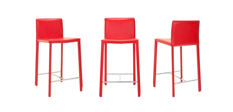
Customers prefer to see the product from different angles, which exhibits the product & helps the buyer to look at the product from a different perspective that ensures the delivery of the same item that they saw on their screen, but to showcase it must be in the center and front. Plus, the images must be in similar style and effects to maintain the unity of all product images, irrespective of type.
The most straightforward technique is to maintain the consistency and proper organization of your product images to market them on your storefront. It is recommended to use at least four different product images. Finally, ecommerce product photography is inevitable, which brings your product to life.
Around 70% of the big player in the market prefer to invest in content marketing, including product photography; plus, you can increase your online store conversion by 30% with good product photography. However, you can avoid the expense of paying a considerable amount to expert photographers by buying a tripod or premade set that will be leveraged for all images.
Use A White Or Any Simple Coloured & Consistent Background
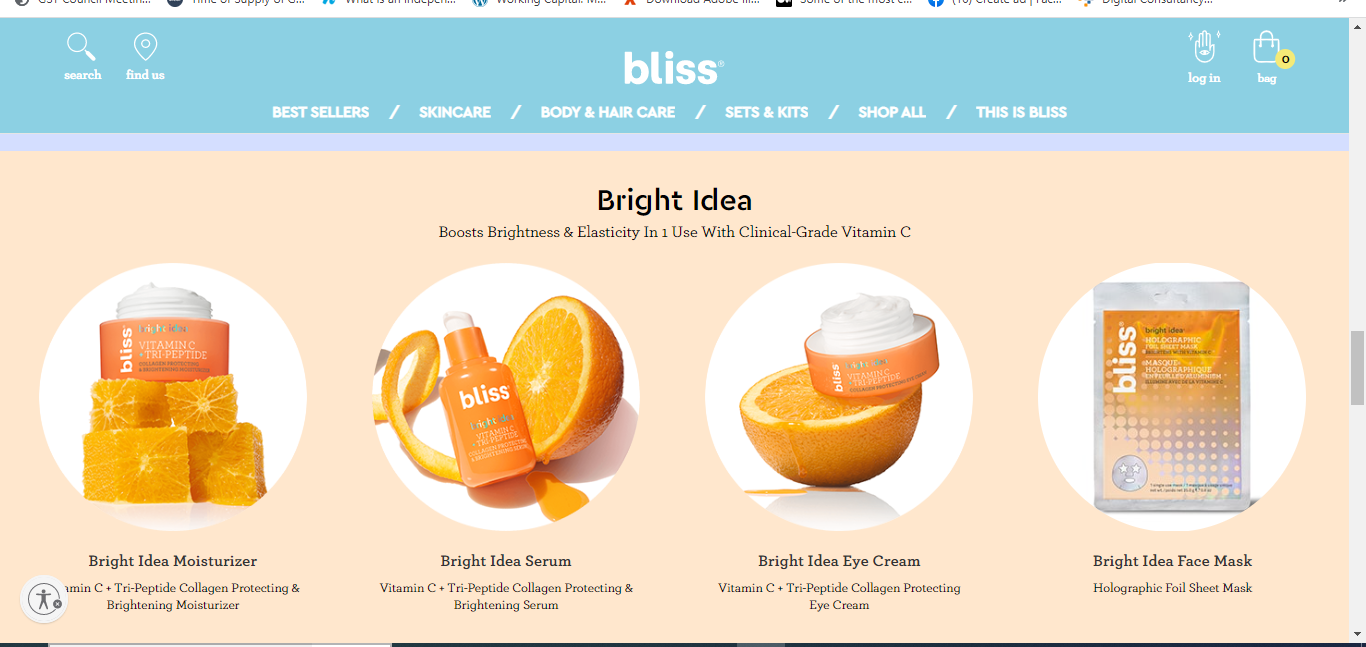
Background colors highly impact the user’s mindset of how he/she perceives the product, so keeping it just neutral would be better. The white color helps minimize distraction and clearly demonstrates the product with small details from diverse corners; thus, it is a universal approach followed by many ecommerce store admins.
However, you can also opt for a color matching your brand image, so you can choose different monochrome colors, but it must make the product details stand out and showcase the true color of the product without washing out its actual appearance. This marketing strategy technique will enhance buyers’ trust in your brand. For this, you can refer to the above pasted image of bliss (beauty brand).
Optimize The Image According To SEO Basics
Images are able to generate a lot of traffic for your ecommerce store, so optimizing product images for search engines is significant, and this can be done with various search engine strategies to gain visibility and proper optimization; here are some of them:
- Alt Text – Websites can’t render the images, so Alt attributes work as an alternative. Plus, web page crawlers can’t see the images as humans, so they assist them in understanding. You must include at least one keyword in your alt text and use relevant wording to define the content of the image. Even you can see the alt text while hovering over the image shown on the search engine.
- File Type – JPEG, PNG, and GIF are the most common file type used to post images on the web. Among these, JPEG is the standard file type that can be easily compressed and used in good quality with a smaller size. GIFs are usually used for icons and decorative images and support animation too. GIF works well for small & simple images, but is not a good choice when it comes to complex images. On the other hand, PNG images are more sophisticated as compared to GIFs and are getting more popular as compared to GIFs.
- Image Sitemap – You can list all your image locations in an image sitemap, as it helps the search engine in getting additional information when crawling a website. Sitemap help to find the images that are difficult to search, which also facilitates your website to rank higher on SERP.
Demonstrate The Complete Product
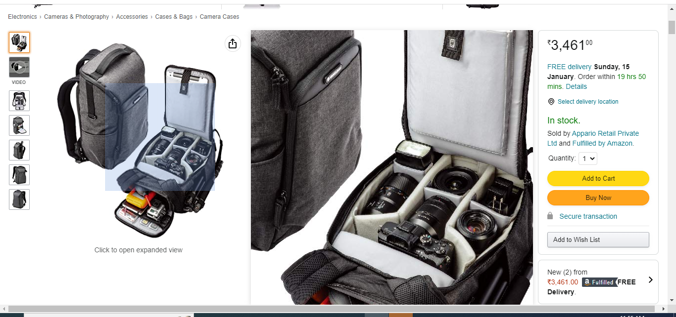
How can you sell a product without displaying it totally, as shown in the DSLR backpack featured in the Amazon store? Do you think, as a customer, you will feel satisfied by looking at the half-cutting image of a product or a product in which all parts are not demonstrated and expect customers to buy and give good product reviews? Such images can mislead the buyers, which will be opposite to what they expected while landing on your store.
You must provide numerous images of the same product with detailed shots through which consumers will learn the quality and features. With complete image, buyers will be able to contextualize what they’re purchasing. Plus, this is an excellent opportunity to perfectly view your product, which increases your conversion rates too.
There are chances you are dealing with items that comprise other parts or at least 2 or 3 parts of a product. Then you must display what the customer will get inside the box. It shows the accurate representation of the full product and helps buyers to understand all parts & features of the product.
Stay Away From Displaying Decorative Images
Surely photographs grab the attention, but according to a study, it shows that our brain ignores decorative images. Adding some more components like borders, lining, and others are not required all the time. Plus, some decorative images enhance the look but result in more loading speed, which again is a drawback.
Your images should simply showcase the product you are selling. However, if there is a requirement to make use of decorative images, then size should be reduced by harnessing CSS to create styling for replacing embellishing product images, shrinking the background wallpaper, or cutting out the middle of the background image if possible.
Follow The Best Practices for eCommerce Product Images Photography:
Today’s ecommerce experience is not concise to just creating an online store on any popular platform. A genuine functional and high-performing store is an amalgamation of many different practices, whether it is related to ecommerce product photography or any other forefront tactic. However, images are the first thing that draws attention, and then words.
Better images lead to better decisions. All the stated points are directly from ecommerce experts that will support your company to achieve goal-oriented results with unique methods to create a path for users while they land on your store and start choosing the products.
However, if you are stuck at any point while optimizing your ecommerce product images, lt use guide you.


