Best Practices for Improving e-Commerce Checkout Flow
An overview of the e-commerce checkout process:
An eCommerce checkout process is like a grand finale for an ecommerce website that includes specific steps that a consumer should follow to complete a purchase. It is the place where the patron finalizes the choices of products, confirms the shipping selection and makes the payment to purchase the product. Therefore, a well designed and simple checkout is necessary to reduce abandonment by consumers.
It is an important part of improving the conversion in e-commerce. As a retailer, you make efforts including money and time to attract visitors to your website. Lots of marketing and advertising content is required to promote and move the product. These all efforts will be worthless if customers do not complete the checkout process and finalize the purchase of the product. The success of e-commerce websites depends on the sale of products. Your website can attract customers but the decision to purchase the products depends on the customer.
As per Baymard research, an average abandonment cart rate is 69.80% and nearly 1 out of 5 shoppers abandon the cart due to complexity in the checkout process. So, every eCommerce store owner should be aware about the checkout best practices, as it will help in reducing the wastage of time and money. It also allows customers to differentiate between different e-commerce sites while making purchases.
E-commerce store owners can hire Magento 2 developers , to help them in improving the website checkout page. They help in reducing abandonment cart rates by including attractive features and specialities that can attract more consumers and finalize the purchase of products.
This article helps you in converting your website visitors to customers who purchase products from your page. But, first, let’s discuss some e-commerce checkout best practices to improve the sales and profit of your business.
All e-commerce websites have six steps in the checkout process and the retailers should follow ecommerce checkout flow best practices wisely to attract more customers.
This process goes like
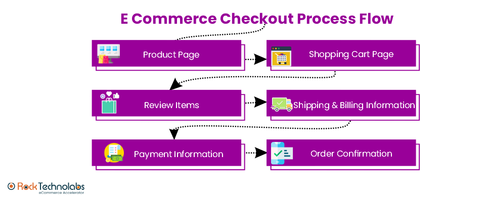
The customer has to fulfil the order confirmation process for successful checkout. The e-commerce checkout page should be optimized in such a way so that customers enjoy shopping with your site without any boredom and payment troubles.
In this upcoming discussion, you will be going to see some main practices that are necessary for the checkout process and the reasons why customers abandon the checkout
Let’s discuss best checkout practices and strategies to follow.
-
1. Prioritize Mobile-friendly Website Design
As an e-commerce retailer, your priority should be to offer shopping ease to consumers. Nowadays, patrons are using mobile phones for shopping as well as payments. So, it is the responsibility of retailers to focus on mobile-friendly UX and designs. When you opt for the development, design, and optimization of the checkout page, you need to focus on a mobile-friendly design that is uniform in all devices.

Image Source: Amazon
-
2. Create One Page Checkout
Making a complicated checkout leads to abandonment halfway. A one-page checkout or a maximum of two pages is ideal for an easy and fast process. No wonder the customer also searches for those checkouts that are simple, easy to follow, and consume less time.
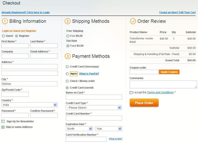
Image Source: Thecommerceshop
-
3. Avoid Additional Charges During the Purchase
Including information on shipping and taxes during the checkout makes the pricing details more transparent. However, if you include any surprise or additional charges after selecting the product, it may lead to abandons.
-
4. Always Include Customers Support Information on the Page
There are many instances in the checkout process where customers directly want to know more details. At that point including the customer’s support number or chat support helps retain the customers and moves them to buy the product. One of the best ways to manage all this is to trigger a chatbot to assist customers.
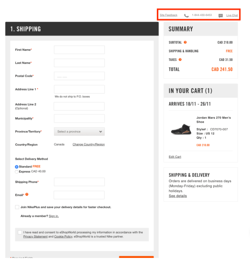
Image Source: Nike
-
5. Always Allow Guest Checkout
You cannot mandate or stress a customer to create an account or register themselves for proceeding to checkout. This may sometimes lead to added steps for customers and may lead to a slow down of the whole process. It may also urge customers to rethink whether to proceed or not. To avoid all this, always include guest checkout options so that customers can get the option to proceed by just offering an email id or contact number.
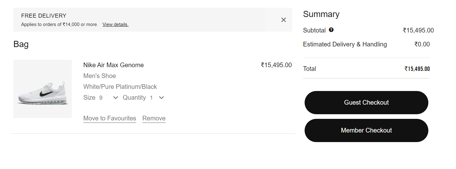
Image source: Nike
-
6. Avoid Distractions During Checkout
The first and foremost thing you have to consider is to think from the customer’s perspective. When you want to purchase a product, you only get more details on the same thing. Limited header with no footer and layout with minimal menu options retains the customer on the same page. Minimal distractions can reduce cart abandonment and improve conversions. The checkout page examples should almost look like the main website page. This will reduce the stress of consumers on wondering what page is this.
-
7. Include Coupon or Promo Code
Whenever possible, try to include discounts, coupons or promo codes because everyone likes to get some rebates or something extra after shopping, either in the form of cash benefit or gift coupon. All these benefits should be easy to understand, follow and apply. The coupon fields should be visible and easy to understand.
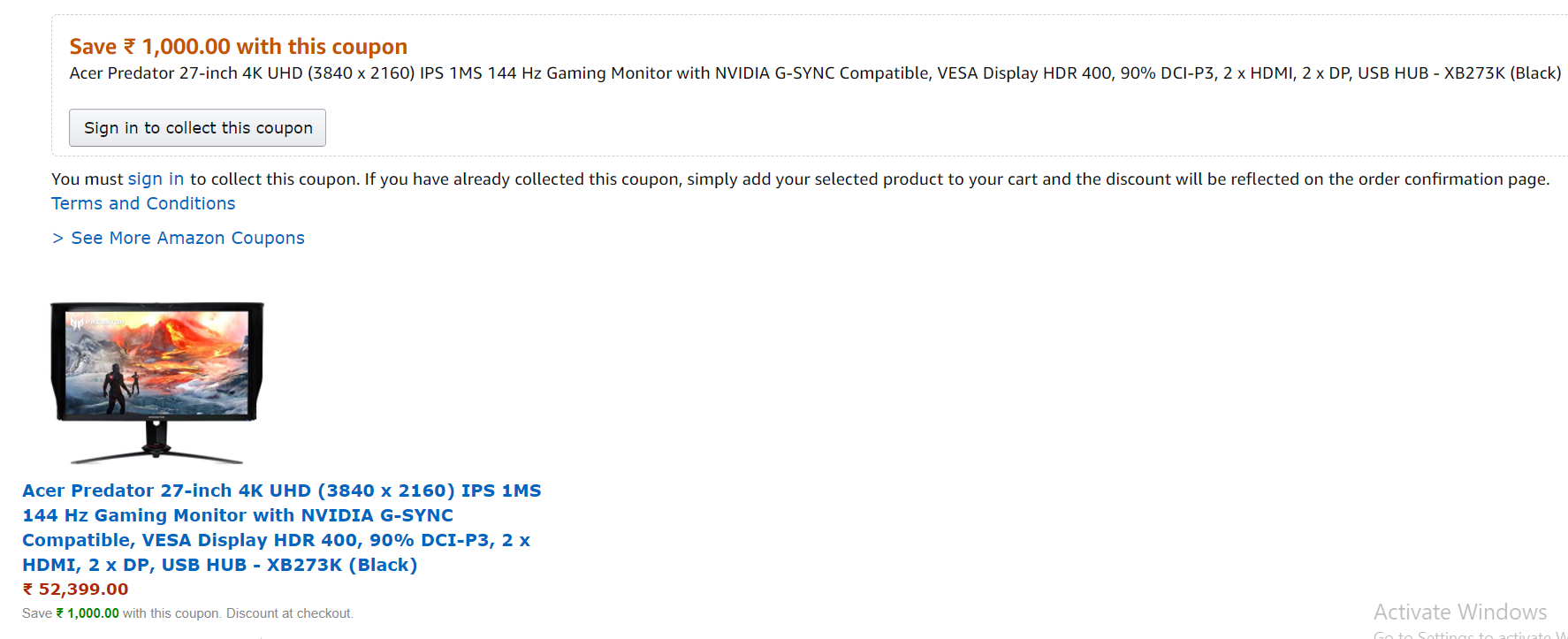
Image Source: Amazon
-
8. Include Data Validation and Notification on Input Error
Always try to include data validation and notifications for error inputs by customers. This will help in reducing errors from the customer end and getting more accurate details of customers. The same feature ensures that all input data are correct and valid. This feature also helps in guiding and simplifying the whole process of data entry process.
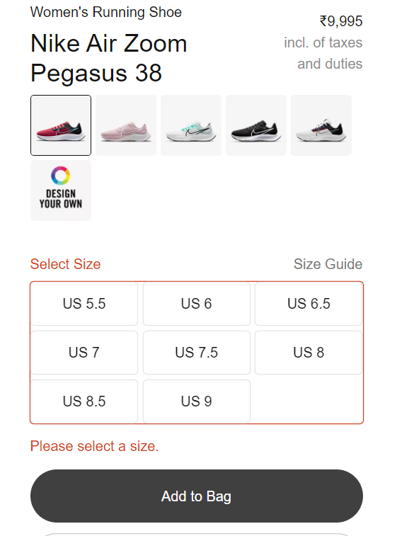
Image Source: Nike
-
9. Transparency in Pricing and Products
The customers should have a clear outline of what goods are there in the cart. The correct image, attributes, size, and colour of the product should be present. The vouchers should be included in a well-mannered cluster. Try to use different colors for additional information that help in differentiating the concepts.
-
10. Avoid Redundant and Irrelevant Questions
Many users leave the cart page as they are tired of typing irrelevant and useless information, like landmarks, mobile numbers, postal address and billing address, etc. In most cases, the billing address and shipping address are the same. Try to include the option that prefills the billing address with the shipping address to avoid wastage of time and interest.
-
11. Offer Adequate Payment Options
It is always important to offer the best payment methods to customers. Try to prioritize popular methods first and develop the options for business development and feasible scaling methods. There are customers who choose their own preferred method, but some use the best option available.
-
12. Always Use Security Seals and Badges
To confirm the security of your ecommerce platform always use security seals and badges. This allows customers to confirm that the whole checkout process is secure and safe. This also helps in developing confidence among customers.
-
13. Auto Saving the Cart Content when Abandoned
Including an auto-save option for cart items during abandonment helps in saving customer’s time. This option allows customers to directly return to the checkout option without browsing and finding products again and again.
-
14. Confirmation of Post-payment Order
When a customer completes the order, always include the notification for post-purchase with the thanking option. Try to send a notification that can summarize the order with shipping and taxes details, count, total amount and estimated time of delivery. This will help in building customer trust.
-
15. Offer benefits to your customers
Always try to offer additional benefits to customers with a free shipping facility and discounts that urges customers to finalize the checkout process. Limited sale offers also help in attracting customers to purchase the items.
-
16. Always Keep Simple Checkout
Complexity in checkout ultimately leads to abandonment as it might be difficult for consumers to understand everything. Detailed information on a product with a single payment page makes it more feasible for patrons to move forward with the selection.
We discussed some best checkout page templates and strategies for optimization. In the upcoming discussion, we will see some reasons that prompt customers to abandon the checkout halfway.
Common Reasons for Shopping Cart Abandonment
-
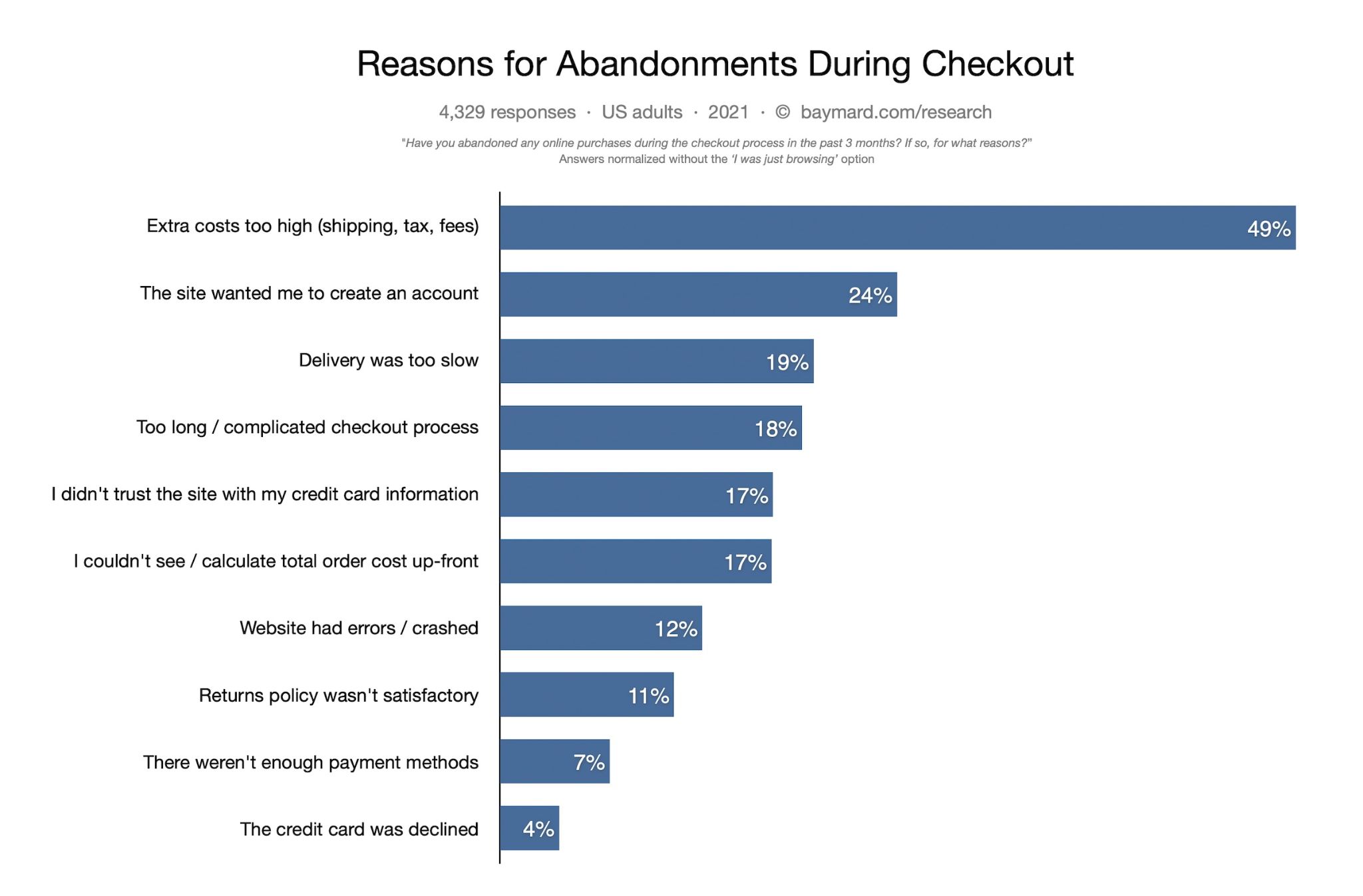
1. Additional fees:
The costs and fees being included in the order summary during purchase urge customers to recheck the value of their buying. In some cases, these additional charges lead to a change of mind for customers.
-
2. Mandatory registration and creation of an account:
Sometimes, customers are mandated to register themselves for proceeding onwards in the whole purchase process. In these cases, sometimes the mind of the customer changes, and they move out. The website should not hinder the checkout process best practices. Instead, you should include guest checkout options.
-
3. Complicated checkout process:
Customers in the checkout always want a fast experience purchasing online. Including complexities in the whole process with more information and time-consuming data may lead to on-the-spot abandonment of the cart.
-
4. Performance issues on the checkout page with errors and crashes:
Sometimes, the website faces some minor issues that can be changed or repaired without hampering the e-commerce checkout flow, but sometimes consistency in these errors and crashes may lead to failure in offering an optimized user experience. This also may lead to trust issues in the payment process.
-
5. Absence of good payment methods and shipping methods:
Sometimes, retailers fail to offer unique shipping options and payment methods. In these situations, the convenience of customers gets compromised and they won’t move forward to purchase a product. Sometimes customers prefer to ship the product through their preferred courier service or try to pay through their preferred method. One of the most popular shipping methods after Covid-19 is BOPIS that allows customers to buy online and pick up in store and If you are a Magento store owner, you can simply add Magento 2 store pick up extension to make it easy for your customers. Failing to offer all these services lead to abandonment.
Here are other interesting stats that US online shoppers consider before buying products.
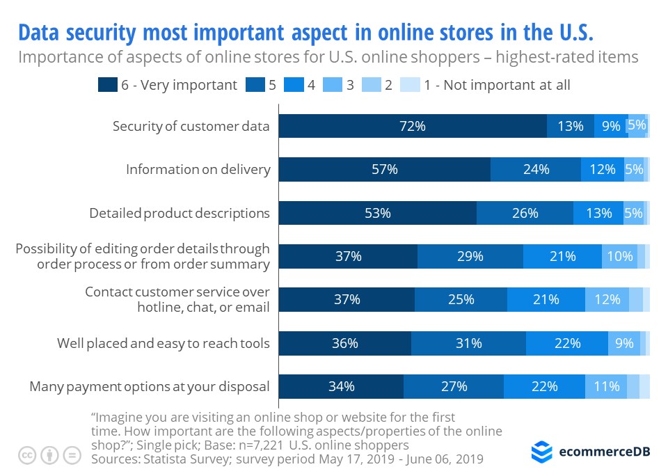
Source- ecommerceDB
Conclusion
It is important to consider e-commerce checkout best practices for attaining good sales and customer reviews. Sometimes retailers overlook this particular process and this leads to business loss.
Conversion rate optimization is a consistent process that includes developing ideas, making changes, and testing its effects on sales. This will also help you understand that optimization is one of the crucial parts of the whole process.
If you seek more information on strategies to improve the checkout process, you can contact us for more assistance. Happy to help you.


